
Home Color Trends Away From Gray
For about a decade, gray ruled everything. Gray walls. Gray cabinets. Gray floors. Gray furniture. The cool, clean, almost-blue palette that looked so sharp in listing photos became the default setting for American interiors, and somewhere along the way, a lot of homes started feeling a little cold.
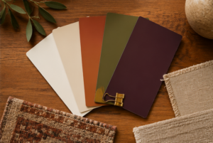
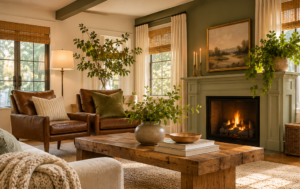
We are past that now. Not suddenly, not dramatically, but steadily — the shift toward warmth has been happening for a few years and it is not slowing down. Warmer whites. Earthy greens. Terracotta. Plum. Creamy beiges that feel like an exhale after years of slate.
The good news: you do not have to gut your house to feel the difference. Even if you bought gray furniture and painted everything Agreeable Gray and cannot change any of it right now, there are real moves you can make that shift the feeling of a room without touching a wall.
What colors are replacing gray in homes right now?
Warm, earthy, and a little muddy, in the best possible way.
The colors gaining ground right now are the ones that feel grounded rather than cool. Think muddier greens over the blue-greens that dominated a few years ago. Olive, sage, moss, greens that read as earthy rather than aquatic. Warm whites and creamy off-whites that have a little yellow or pink in the undertone rather than a blue one. Terracotta and rust, which have moved from accent to main event in a lot of spaces. Plum and deep wine, which are having a real moment and feel luxurious in the right context.
What all of these have in common is warmth. They make a room feel inhabited, cozy, like someone actually lives there. After years of homes styled to look like high-end hotel lobbies, that feeling is what people are craving right now.
What should I do about all the gray furniture I bought?
Work with it, not against it.
Gray furniture, especially the darker charcoal and slate pieces that were everywhere from 2015 to 2022, is not going anywhere fast. Most of us cannot replace a sofa just because the trend shifted, and honestly, we should not have to.
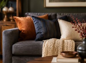
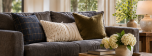
The key is in what you put around it. Gray is a neutral, which means it will take direction from the colors you introduce near it. A dark gray sofa styled with cool white pillows and silver accessories is going to keep reading as cold. That same sofa with creamy linen pillows, a rust or terracotta throw, some navy accents, and a warm wood coffee table reads completely differently. The sofa did not change. The feeling of the room did.
This is something I deal with in my own house. I have a dark gray sofa that is not going anywhere yet. We have a dog and kids, and there is simply no point. But layering in creamy beiges and whites, adding pillows in navy and rust, and bringing in warm wood tones has made it work in a way that feels current and cozy rather than dated. The gray disappears into the background. The warmth is what you notice.
The principle: introduce your warm colors through the things that are easy and inexpensive to change. Pillows. Throws. Rugs. Art. Lamps. These are the moves that shift a room’s temperature without requiring you to start over.
Which paint colors should I consider if I’m ready to move on from gray walls?
A few directions worth exploring, depending on what you want the room to feel like.
Warm whites and creamy off-whites. If you want something that feels fresh without being stark, look for whites with a warm undertone — a little cream, a little blush, a little warmth. Benjamin Moore’s White Dove, Sherwin-Williams’ Alabaster, and similar tones have become workhorses for a reason. They photograph well, they make rooms feel larger, and they do not have the faint blue cast that cool whites and light grays often do.
Earthy greens. Olive, sage, and moss greens are versatile in a way the blue-greens were not. They work in kitchens, living rooms, and bedrooms, they pair beautifully with warm wood tones and natural materials, and they have a timelessness that the more saturated blue-greens lack. If you painted a room Sea Salt or Rainwashed five years ago and it is starting to feel like a spa that you are tired of, an earthy green is a natural next step.
Warm taupes and greiges. Not beige-beige — the tan-forward neutrals of the early 2000s — but warm greiges that have some depth and interest. These are the evolved answer to cool gray. They do the same job as gray (flexible neutral, works with almost anything) but without the chill.
Terracotta and rust as accents. These are not necessarily full-wall colors for most people, but as an accent wall, in a powder room, or in a smaller space, they bring a richness and warmth that transforms a room. Paired with creamy whites and natural wood, they feel modern and grounded at the same time.
Plum and deep wine. This one surprises people, but deep, moody purples with a warm undertone are a genuinely beautiful choice for a dining room, a study, or a primary bedroom. They feel luxurious and cozy in a way that dark blue-greens like navy — which were everywhere in accent walls for years — no longer quite do.
What about all the gray flooring that got installed in the 2010s?
This is the harder problem, and we will be honest: gray LVP and light gray hardwood is going to look a little dated for a while before it cycles back or people replace it. You are not alone.
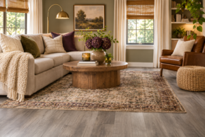
The same principle applies as with furniture. Gray floors are a neutral, and they take direction from what is above them. Cool gray floors styled with cool white walls and cool gray furniture are a gray sandwich, and it shows. The same gray floors with warm wall colors, warm wood furniture, and layered textiles read very differently.
If you are not replacing the floors anytime soon, the wall color matters even more. Going warm on the walls — a creamy white, a warm greige, an earthy green — will do more to counteract gray floors than almost anything else. Just be sure to add some cooler tones in accessories, maybe use nickel hardware, so it doesn’t feel totally out of place in an all warm room. Combining colors and tones is crucial here!
Does this matter if I’m thinking about selling?
It does, and here is why.
Buyers touring homes right now are often walking through properties that all look the same — cool gray walls, gray LVP floors, white subway tile, brushed nickel fixtures. The houses that stand out in listing photos and in person are the ones that feel warm and distinctive without being weird. A home that feels cozy and alive photographs better, shows better, and often sells faster than an identical floor plan staged in the now-ubiquitous cool gray palette.
That does not mean you need to paint everything terracotta before you list. But if you are doing any touch-up painting or refreshing accessories before you sell, steering toward warmth is a smart move. A creamy white on the walls instead of a cool gray, warm-toned art and textiles, and a few well-placed plants can change the feeling of a home without a significant investment.
We have seen it make a real difference in how a home is received.
Our experience. Your legacy.
Related reading:
- Home Staging in Denver: What Actually Moves the Needle
- Denver Home Repair Priorities: What to Fix Before You List
- Getting Your Home Ready to Sell in Denver
- Why Your Neighbor’s House Sold for More Than Yours
- What to Look Out for When Buying a House
External Links:
- Architectural Digest on color trends: https://www.architecturaldigest.com/story/color-trends
- Benjamin Moore Color of the Year resources: https://www.benjaminmoore.com/en-us/color-overview/find-your-color/color-of-the-year